《精通react/vue組件設(shè)計》之實現(xiàn)一個健壯的警告提示(Alert)組件
前言
本文是筆者寫組件設(shè)計的第七篇文章, 今天帶大家實現(xiàn)一個自帶主題且可關(guān)閉的Alert組件, 該組件在諸如Antd或者elementUI等第三方組件庫中都會出現(xiàn),主要用來提供系統(tǒng)的用戶反饋.
之所以會寫組件設(shè)計相關(guān)的文章,是因為作為一名前端優(yōu)秀的前端工程師,面對各種繁瑣而重復(fù)的工作,我們不應(yīng)該按部就班的去"辛勤勞動",而是要根據(jù)已有前端的開發(fā)經(jīng)驗,總結(jié)出一套自己的高效開發(fā)的方法.
前端組件一般會劃分為如下幾種類型:
- 通用型組件: 比如Button, Icon等.
- 布局型組件: 比如Grid, Layout布局等.
- 導(dǎo)航型組件: 比如面包屑Breadcrumb, 下拉菜單Dropdown, 菜單Menu等.
- 數(shù)據(jù)錄入型組件: 比如form表單, Switch開關(guān), Upload文件上傳等.
- 數(shù)據(jù)展示型組件: 比如Avator頭像, Table表格, List列表等.
- 反饋型組件: 比如Progress進度條, Drawer抽屜, Modal對話框等.
- 其他業(yè)務(wù)類型
所以我們在設(shè)計組件系統(tǒng)的時候可以參考如上分類去設(shè)計,該分類也是antd, element, zend等主流UI庫的分類方式.
正文
在開始組件設(shè)計之前希望大家對css3和js有一定的基礎(chǔ),并了解基本的react/vue語法.我們先看看實現(xiàn)后的組件效果:
 圖片
圖片
1. 組件設(shè)計思路
按照之前筆者總結(jié)的組件設(shè)計原則,我們第一步是要確認需求. 一個警告提示(Alert)組件會有如下需求點:
- 能控制Alert組件的樣式
- 能控制Alert組件的關(guān)閉按鈕是否顯示
- 用戶可以自己輸入提示內(nèi)容
- 能控制關(guān)閉按鈕的文本,或者自定義關(guān)閉按鈕
- 支持顯示提示內(nèi)容的輔助文本
- 內(nèi)置提供不同類型的警告提示樣式,比如成功, 錯誤, 警告等
- 關(guān)閉提示時能提供自定義事件
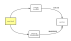
需求收集好之后,作為一個有追求的程序員, 會得出如下線框圖:
 圖片
圖片
對于react選手來說,如果沒用typescript,建議大家都用PropTypes, 它是react內(nèi)置的類型檢測工具,我們可以直接在項目中導(dǎo)入. vue有自帶的屬性檢測方式,這里就不一一介紹了.
通過以上需求分析, 我們發(fā)現(xiàn)實現(xiàn)一個Alert非常簡單, 它屬于反饋型組件,所以不會涉及到太多功能.接下來我們就來看看具體實現(xiàn).
2. 基于react實現(xiàn)一個Alert組件
2.1. Alert組件框架設(shè)計
首先我們先根據(jù)需求將組件框架寫好,這樣后面寫業(yè)務(wù)邏輯會更清晰:
import classnames from 'classnames'
import styles from './index.less'


/**
 * 警告提示組件
 * @param {style} object 更改Alert樣式
 * @param {closable} bool 是否顯示關(guān)閉按鈕, 默認不顯示
 * @param {closeText} string|reactNode 自定義關(guān)閉按鈕
 * @param {message} string 警告提示內(nèi)容
 * @param {description} string 警告提示的輔助性文字
 * @param {type} string 警告的類型
 * @param {onClose} func 關(guān)閉時觸發(fā)的事件
 */
function Alert(props) {
  const {
    style,
    closable,
    closeText,
    message,
    description,
    type,
    onClose
  } = props


  return <div className={styles.xAlertWrap}>
          <div className={styles.alertMes}>{ message }</div>
          <div className={styles.alertDesc}>{ description }</div>
          <span className={styles.closeBtn}>{ closeText ? closeText : 'x' }</span>
         </div>
}


export default Alert
有了這個框架,我們就來往里面實現(xiàn)內(nèi)容吧.
2.2 實現(xiàn)style,closeText,message, description,type
這幾個功能在框架搭建好之后已經(jīng)部分實現(xiàn)了,是因為他們都比較簡單,不會牽扯到其他復(fù)雜邏輯.只需要對外暴露屬性并使用屬性即可. 具體實現(xiàn)如下:
function Alert(props) {
  const {
    style,
    closable,
    closeText,
    message,
    description,
    type,
    onClose
  } = props


  return <div
      className={classnames(styles.xAlertWrap, styles[type] || styles.warning)}
      style={{
        ...style
      }}
    >
      <div className={styles.alertMes}>{ message }</div>
      <div className={styles.alertDesc}>{ description }</div>
      <span className={styles.closeBtn}>{ closeText ? closeText : 'x' }</span>
    </div>
}
以上代碼可以發(fā)現(xiàn)筆者采用了classnames這個第三方工具, 他可以組合我們的class以實現(xiàn)更靈活的配置. 對于type的實現(xiàn),我的思路是提前預(yù)制好幾種類型樣式, 通過用戶手動配置來匹配到對應(yīng)的樣式:
.xAlertWrap {
  box-sizing: border-box;
  position: relative;
  padding: 5px 12px;
  margin-bottom: 16px;
  border-radius: 3px;
  &.success {
    background-color: #f6ffed;
    border: 1px solid #b7eb8f;
  }
  &.info {
    background-color: #e6f7ff;
    border: 1px solid #91d5ff;
  }
  &.error {
    background-color: #fffbe6;
    border: 1px solid #ffe58f;
  }
  &.warning {
    background-color: #fff1f0;
    border: 1px solid #ffa39e;
  }
}
2.3 實現(xiàn)closable和onClose
closable主要是用來讓用戶能手動關(guān)閉Alert,onClose是對外暴露的關(guān)閉時的方法, 因為沒必要也不需要向外暴露屬性來讓Alert關(guān)閉, 所以最好的方式是在組件內(nèi)部實現(xiàn), 我們會通過useState這個鉤子來處理,代碼如下:
function Alert(props) {
  const {
    style,
    closable,
    closeText,
    message,
    description,
    type,
    onClose
  } = props
  let [visible, setVisible] = useState(true)


  const handleColse = () => {
    setVisible(false)
    onClose && onClose()
  }
  return visible ?
    <div
      className={classnames(styles.xAlertWrap, styles[type] || styles.warning)}
      style={{
        opacity: visible ? '1' : '0',
        ...style
      }}
    >
      <div className={styles.alertMes}>{ message }</div>
      <div className={styles.alertDesc}>{ description }</div>
      {
        !!closable && <span className={styles.closeBtn} notallow={handleColse}>{ closeText ? closeText : 'x' }</span>
      }
    </div> : null
}
通過控制visible來控制Alert的出現(xiàn)和消失, 并且當點擊關(guān)閉按鈕時能調(diào)用外部暴露的onClose方法.
2.4 健壯性支持, 我們采用react提供的propTypes工具:
import PropTypes from 'prop-types'
// ...
Alert.propTypes = {
  style: PropTypes.object,
  closable: PropTypes.bool,
  closeText: PropTypes.oneOfType([
    PropTypes.string,
    PropTypes.element
  ]),
  message: PropTypes.string,
  description: PropTypes.string,
  type: PropTypes.string,
  onClose: PropTypes.func
}
關(guān)于prop-types的使用官網(wǎng)上有很詳細的案例,這里說一點就是oneOfType的用法, 它用來支持一個組件可能是多種類型中的一個. 組件完整css代碼如下:
.xAlertWrap {
  box-sizing: border-box;
  position: relative;
  padding: 5px 12px;
  margin-bottom: 16px;
  border-radius: 3px;
  &.success {
    background-color: #f6ffed;
    border: 1px solid #b7eb8f;
  }
  &.info {
    background-color: #e6f7ff;
    border: 1px solid #91d5ff;
  }
  &.error {
    background-color: #fffbe6;
    border: 1px solid #ffe58f;
  }
  &.warning {
    background-color: #fff1f0;
    border: 1px solid #ffa39e;
  }


  .alertMes {
    margin-bottom:5px;
    color: rgba(0, 0, 0, 0.85);
    font-size: 14px;
    line-height: 1.5em;
  }
  .alertDesc {
    color: rgba(0, 0, 0, 0.65);
    font-size: 14px;
    line-height: 1.5em;
    word-break: break-all;
  }
  .closeBtn {
    position: absolute;
    right: 8px;
    top: 5px;
    color: rgba(0, 0, 0, 0.4);
    cursor: pointer;
  }
}
通過以上步驟, 一個健壯的的Alert組件就完成了,關(guān)于代碼中的css module和classnames的使用大家可以自己去官網(wǎng)學(xué)習(xí),非常簡單.如果不懂的可以在趣談前端技術(shù)群里提問,筆者看到后會第一時間解答.
2.5 使用Alert組件
我們可以通過如下方式使用它:
<Alert message="溫馨提示,你忘帶口罩了" />
<Alert message="溫馨提示,你注冊成功" type="success" />
<Alert message="錯誤提示,你沒洗手了" type="error" />
<Alert message="提示: 我們開始吧" type="info" />
<Alert message="提示: 我可以關(guān)閉了" type="info" closable notallow={() => { alert(111) }} /><Alert message="注冊成功" descriptinotallow="你在本網(wǎng)站已經(jīng)注冊成功,謝謝您的支持和反饋,多交流真正的技術(shù)吧" closable type="success" />
筆者已經(jīng)將實現(xiàn)過的組件發(fā)布到npm上了,大家如果感興趣可以直接用npm安裝后使用,方式如下:
npm i @alex_xu/xui
// 導(dǎo)入xui
import {
  Button,
  Skeleton,
  Empty,
  Progress,
  Tag,
  Switch,
  Drawer,
  Badge,
  Alert
} from '@alex_xu/xui'
該組件庫支持按需導(dǎo)入,我們只需要在項目里配置babel-plugin-import即可,具體配置如下:
// .babelrc
"plugins": [
  ["import", { "libraryName": "@alex_xu/xui", "style": true }]
]
npm庫截圖如下:
 圖片
圖片
最后
之前筆者已經(jīng)實現(xiàn)了:
- modal(模態(tài)窗),
- badge(徽標),
- table(表格),
- tooltip(工具提示條),
- Skeleton(骨架屏),
- Message(全局提示),
- form(form表單),
- switch(開關(guān)),
- 日期/日歷,
- 二維碼識別器組件
等組件, 來復(fù)盤筆者多年的組件化之旅.