Python數(shù)據(jù)分析條形圖的各種繪制方式
作者:Python集結(jié)號
Python數(shù)據(jù)分析條形圖的各種繪制方式,包括:簡單垂直條形圖、簡單水平條形圖、水平交錯(cuò)條形圖、垂直堆疊條形圖等。
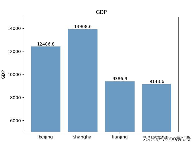
簡單垂直條形圖
- GDP = [12406.8, 13908.57, 9386.87, 9143.64]
- # 繪圖
- plt.bar(range(4), GDP, align='center', color='steelblue', alpha=0.8)
- # 添加軸標(biāo)簽
- plt.ylabel('GDP')
- # 添加標(biāo)題
- plt.title('GDP')
- # 添加刻度標(biāo)簽
- plt.xticks(range(4), ['beijing', 'shanghai', 'tianjing', 'chongjing'])
- # 設(shè)置Y軸的刻度范圍
- plt.ylim([5000, 15000])
- # 為每個(gè)條形圖添加數(shù)值標(biāo)簽
- for x, y in enumerate(GDP):
- plt.text(x, y + 100, '%s' % round(y, 1), ha='center')
- plt.show()
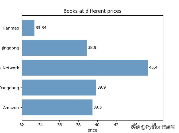
簡單水平條形圖
- # 導(dǎo)入繪圖模塊
- import matplotlib.pyplot as plt
- # 構(gòu)建數(shù)據(jù)
- price = [39.5, 39.9, 45.4, 38.9, 33.34]
- # 繪圖
- plt.barh(range(5), price, align='center', color='steelblue', alpha=0.8)
- # 添加軸標(biāo)簽
- plt.xlabel('price')
- # 添加標(biāo)題
- plt.title('Books at different prices')
- # 添加刻度標(biāo)簽
- plt.yticks(range(5), ['Amazon', 'Dangdang', 'China Books Network', 'Jingdong', 'Tianmao'])
- # 設(shè)置Y軸的刻度范圍
- plt.xlim([32, 47])
- # 為每個(gè)條形圖添加數(shù)值標(biāo)簽
- for x, y in enumerate(price):
- plt.text(y + 0.1, x, '%s' % y, va='center')
- plt.savefig('foo.png')
- # 顯示圖形
- plt.show()
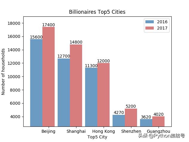
水平交錯(cuò)條形圖
- # 導(dǎo)入繪圖模塊
- import matplotlib.pyplot as plt
- import numpy as np
- Y2016 = [15600, 12700, 11300, 4270, 3620]
- Y2017 = [17400, 14800, 12000, 5200, 4020]
- labels = ['Beijing', 'Shanghai', 'Hong Kong', 'Shenzhen', 'Guangzhou']
- bar_width = 0.45
- # 繪圖
- plt.bar(np.arange(5), Y2016, label='2016', color='steelblue', alpha=0.8, width=bar_width)
- plt.bar(np.arange(5) + bar_width, Y2017, label='2017', color='indianred', alpha=0.8, width=bar_width)
- # 添加軸標(biāo)簽
- plt.xlabel('Top5 City')
- plt.ylabel('Number of households')
- # 添加標(biāo)題
- plt.title('Billionaires Top5 Cities')
- # 添加刻度標(biāo)簽
- plt.xticks(np.arange(5) + bar_width, labels)
- # 設(shè)置Y軸的刻度范圍
- plt.ylim([2500, 19000])
- # 為每個(gè)條形圖添加數(shù)值標(biāo)簽
- for x2016, y2016 in enumerate(Y2016):
- plt.text(x2016, y2016 + 100, '%s' % y2016, ha='center')
- for x2017, y2017 in enumerate(Y2017):
- plt.text(x2017 + bar_width, y2017 + 100, '%s' % y2017, ha='center')
- # 顯示圖例
- plt.legend()
- plt.savefig('foo.png')
- # 顯示圖形
- plt.show()
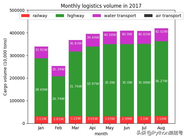
垂直堆疊條形圖
- # 導(dǎo)入模塊
- import matplotlib.pyplot as plt
- import numpy as np
- import pandas as pd
- # 導(dǎo)入數(shù)據(jù)
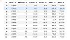
- traffic_volume = {'Index': ['railway', 'green', 'water transport', 'air transport'],
- 'Jan': [31058, 255802, 52244, 57],
- 'Feb': [28121, 179276, 46482, 42],
- 'Mar': [32185, 285446, 50688, 59],
- 'Api': [30133, 309576, 54728, 57],
- 'May': [30304, 319713, 55813, 60],
- 'Jun': [29934, 320028, 59054, 58],
- 'Jul': [31002, 319809, 57353, 55],
- 'Aug': [31590, 331077, 57583, 57]}
- data = pd.DataFrame(traffic_volume)
- print(data)
- # 繪圖
- plt.bar(np.arange(8), data.loc[0, :][1:], color='red', alpha=0.8, label='railway', align='center')
- plt.bar(np.arange(8), data.loc[1, :][1:], bottom=data.loc[0, :][1:], color='green', alpha=0.8, label='highway',
- align='center')
- plt.bar(np.arange(8), data.loc[2, :][1:], bottom=data.loc[0, :][1:] + data.loc[1, :][1:], color='m', alpha=0.8,
- label='water transport', align='center')
- plt.bar(np.arange(8), data.loc[3, :][1:], bottom=data.loc[0, :][1:] + data.loc[1, :][1:] + data.loc[2, :][1:],
- color='black', alpha=0.8, label='air transport', align='center')
- # 添加軸標(biāo)簽
- plt.xlabel('month')
- plt.ylabel('Cargo volume (10,000 tons)')
- # 添加標(biāo)題
- plt.title('Monthly logistics volume in 2017')
- # 添加刻度標(biāo)簽
- plt.xticks(np.arange(8), data.columns[1:])
- # 設(shè)置Y軸的刻度范圍
- plt.ylim([0, 500000])
- # 為每個(gè)條形圖添加數(shù)值標(biāo)簽
- for x_t, y_t in enumerate(data.loc[0, :][1:]):
- plt.text(x_t, y_t / 2, '%sW' % (round(y_t / 10000, 2)), ha='center', color='white', fontsize=8)
- for x_g, y_g in enumerate(data.loc[0, :][1:] + data.loc[1, :][1:]):
- plt.text(x_g, y_g / 2, '%sW' % (round(y_g / 10000, 2)), ha='center', color='white', fontsize=8)
- for x_s, y_s in enumerate(data.loc[0, :][1:] + data.loc[1, :][1:] + data.loc[2, :][1:]):
- plt.text(x_s, y_s - 20000, '%sW' % (round(y_s / 10000, 2)), ha='center', color='white', fontsize=8)
- # 顯示圖例
- plt.legend(loc='upper center', ncol=4)
- # 顯示圖形
- plt.show()
以上就是各種條形圖的繪制方式,你Get到了嗎?
責(zé)任編輯:未麗燕
來源:
今日頭條